Computations with large datasets
Contents
Computations with large datasets
This notebook introduces a number of commonly-used tools for performing computations with large climate datasets, and demonstrates how common tasks are carried out on chunked data using tools like dask
## This is setup for the plots later on in the notebook - on the website this
## cell (and the cells making the diagrams) is hidden by default, using the 'hide-input' cell tag

import matplotlib
import matplotlib.pyplot as plt
import numbers
import numpy

def draw_chunks(ax, size = (10, 8), nchunks = (5, 2), chunk_size = None, chunk_color = None):
    """
    Draw a chunk diagram

    Args:
        ax:          matplotlib.pyplot axis to draw on
        size:        size of the array (x, y)
        nchunks:     number of chunks (x, y)
        chunk_size:  size of each chunk (x, y) (default size/nchunks)
        chunk_color: colour of each chunk (array with shape nchunks)
    """

    spacing = 0.1

    if chunk_size is None:
        chunk_size = (None, None)

    if chunk_color is None:
        chunk_color = numpy.full(nchunks, 'wheat')
    else:
        chunk_color = numpy.asarray(chunk_color)

    # Fill in None values
    chunk_size = tuple(chunk_size[i] if chunk_size[i] is not None else size[i] / nchunks[i]
                        for i in range(2))

    if isinstance(chunk_size[0], numbers.Number):
        xsize = numpy.full(nchunks[0], chunk_size[0]) - spacing
    else:
        xsize = numpy.asarray(chunk_size[0]) - spacing

    if isinstance(chunk_size[1], numbers.Number):
        ysize = numpy.full(nchunks[1], chunk_size[1]) - spacing
    else:
        ysize = numpy.asarray(chunk_size[1]) - spacing


    # Chunk cell centre
    xc = (numpy.arange(nchunks[0], dtype='f') + 0.5) * (size[0] / nchunks[0])
    yc = (numpy.arange(nchunks[1], dtype='f') + 0.5) * (size[1] / nchunks[1])

    for ii in range(nchunks[0]):
        for jj in range(nchunks[1]):
            box = matplotlib.patches.Rectangle((xc[ii] - xsize[ii]/2,
                                                yc[jj] - ysize[jj]/2),
                                               xsize[ii],
                                               ysize[jj],
                                               facecolor=chunk_color[ii,jj], edgecolor='black')

            ax.add_patch(box)

    ax.set_xbound(0, size[0])
    ax.set_ylim(0, size[1])
    ax.set_xticks([])
    ax.set_yticks([])
    ax.set_frame_on(False)
General tools
If you are a Python user, the most useful packages for climate data are numpy, pandas, xarray and dask to work with larger-than memory arrays and parallel data analysis transparently.
Other useful packages are multiprocessing for simple workflows or mpi4py which is an implementation of the MPI library for Python.
If you are a Fortran/C user then MPI - Message Passing Interface is a low-level library, which is very flexible but also more difficult to set up.
Command-line tools
There are a number of ways to work with big data on the command line.
To parallelise tasks on the command line, there are 3 general options:
GNU Parallel - basic option, good for 10s-hundreds of tasks (and things like parallel rsync). Use when you can process each file or group of files independently.
nci-parallel - uses MPI with core binding so you’ll get more efficient performance for, say, regridding a million model output files
xargs - some people prefer
xargstoparallel, it can be used in conjunction with commands likefindto permit operations simultaneously on many files.
CDO - Climate Data Operators and NCO - NetCDF Operators are powerful command line tools built around netCDF data.
You can also use multiple parallel threads in CDO with
cdo -P <nthreads> ...
and in NCO with
ncks --thr_nbr <nthreads> ...
Python multiprocessing.Pool.map can also be used when working in a python environment and parallel behaviour is needed. Dask is typically easier to use for parallel data analysis, as it figures out on its own how to implement the parallelisation and can also be scaled to a cluster.
Other languages (Matlab, R, etc.)
While we’re not aware of anything quite as nice as Xarray and Dask for other languages, most languages have libraries for reading netCDF files and working with MPI.
If you have suggestions for other libraries we can list here please let us know by opening a ticket
Common Tasks
The chunking illustrations in this section show approximately how these operations are done in Xarray + Dask, to give an idea of their complexity when working with large datasets and a basic idea of how these operations can be implemented manually. Normal arrows mean one chunk on the left gets mapped to one chunk on the right, a left square bracket means the number of chunks is reduced after this operation, a right square bracket means the number of chunks is increased. The most intensive operations are rechunking, as these require a lot of data in-memory, which are indicated with a large square bracket on both left and right.
A ‘reduce’ operation lowers the number of dimensions (e.g. a mean along the time axis). A ‘map’ operation keeps the array size the same (e.g. a rolling mean)
Tasks can be combined - you might calculate a climatology of 90th percentiles for each day in the year, or resample daily data to monthly maximums.
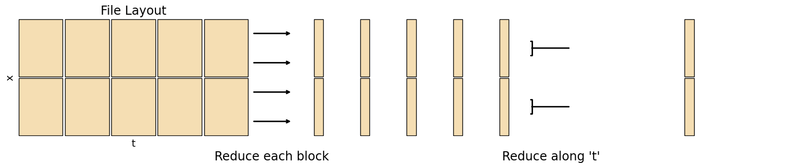
Min / Max / Mean / Stddev
Functions like these are pretty simple to calculate regardless of dataset size, as they don’t require the entire dataset to be in memory. You can just loop over the dimension to be reduced by calculating the value so far up to that step
In pseudocode (in Python you’re better off using data.min(axis=0), as that’s optimised compared to a loop)
for t in range(data.shape[0]):
    out_min = np.minimum(out_min, data[t,...])
    out_max = np.maximum(out_max, data[t,...])
    out_sum = out_sum + data[t,...]

out_mean = out_sum / data.shape[0]
fig, axs = plt.subplots(nrows=1, ncols=3, sharey=True, figsize=(20,3))

draw_chunks(axs[0])
axs[0].set_xlabel('t', fontsize='x-large')
axs[0].set_ylabel('x', fontsize='x-large')
axs[0].set_title('File Layout', fontsize='xx-large')

draw_chunks(axs[1], chunk_size=(0.5, None))

draw_chunks(axs[2], nchunks=(1, 2), chunk_size=(0.5, None))

for i in range(4):
    h = 1/4 * (i+0.5)
    conn = matplotlib.patches.ConnectionPatch((1.02, h), (-0.02, h), axs[0].transAxes, axs[1].transAxes, arrowstyle='->', linewidth=2)
    fig.add_artist(conn)

for i in range(2):
    h = 1/2 * (i+0.5)
    conn = matplotlib.patches.ConnectionPatch((1.02, h), (-0.02, h), axs[1].transAxes, axs[2].transAxes, arrowstyle=']-', linewidth=2)
    fig.add_artist(conn)

fig.add_artist(matplotlib.text.Text(0.375, -0.05, "Reduce each block", fontsize='xx-large',  ha='center', transform=fig.transFigure))
fig.add_artist(matplotlib.text.Text(0.65, -0.05, "Reduce along 't'", fontsize='xx-large',  ha='center', transform=fig.transFigure))

None
Numpy statistics functions
Dask also has optimised implementations for its arrays, e.g. dask.array.mean
Xarray functions work the same as numpy, but keep the xarray metadata and you can use dimension names instead of axis numbers. Weighted operations are also available
CDO
cdo --operators | grep fldwill give a list of basic statistics operations
Python Weighted Mean from Xarray documentation
Percentiles / Median
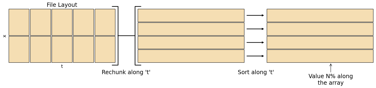
Percentiles are much trickier to calculate than basic statistics. To find the percentiles for a grid cell, you have to load the whole timeseries into memory, sort that timeseries, then find the value \(N\%\) along that sorted timeseries. For a large dataset this becomes very costly, especially since most datasets are stored in a way optimised for loading the whole domain at a single time rather than the timeseries at a single point.
When there are NAN values in the timeseries percentiles become even harder to calculate, as the NAN values must be discarded by the algorithm.
There are approximate ways to compute percentiles that don’t require the whole dataset in memory such as T-digest
Memory concerns are less of an issue when calculating percentiles on a subset of the data - e.g. when calculating climatologies.
fig, axs = plt.subplots(nrows=1, ncols=3, sharey=True, figsize=(20,3))

draw_chunks(axs[0])
axs[0].set_xlabel('t', fontsize='x-large')
axs[0].set_ylabel('x', fontsize='x-large')
axs[0].set_title('File Layout', fontsize='xx-large')

draw_chunks(axs[1], nchunks=(1, 4))

draw_chunks(axs[2], nchunks=(1, 4))
axs[2].annotate('Value N% along\nthe array', (0.6, 0), (0.6, -0.4), 'axes fraction', 'axes fraction', fontsize='xx-large', arrowprops={'arrowstyle': '->'}, ha='center')

regrid_conn = matplotlib.patches.ConnectionPatch((1.02, 0.5), (-0.02, 0.5), axs[0].transAxes, axs[1].transAxes, arrowstyle=']-[', mutation_scale=90, linewidth=2)
fig.add_artist(regrid_conn)

for i in range(4):
    h = 1/4 * (i+0.5)
    sort_conn = matplotlib.patches.ConnectionPatch((1.02, h), (-0.02, h), axs[1].transAxes, axs[2].transAxes, arrowstyle='->', linewidth=2)
    fig.add_artist(sort_conn)

fig.add_artist(matplotlib.text.Text(0.375, -0.05, "Rechunk along 't'", fontsize='xx-large',  ha='center', transform=fig.transFigure))
fig.add_artist(matplotlib.text.Text(0.65, -0.05, "Sort along 't'", fontsize='xx-large',  ha='center', transform=fig.transFigure))

None
Numpy percentile and the more expensive nanpercentile
Dask percentile uses approximate methods so is less memory intensive, but only works on 1D data
Xarray quantile uses values between 0 and 1 instead of percents, Dask data must not be chunked along the axis of interest
CDO
cdo --operators | grep pctlwill give a list of percentile related operations.
Climatologies
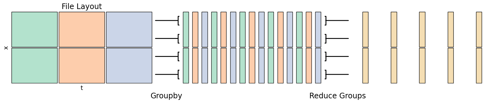
Climatologies combine multiple years worth of data into a single sample year. For instance, a daily mean climatology would output a year of data, with each output day being the mean of all days with the same date from the input. In other words, the output for, e.g., March 3rd would be the average across all March 3rds in the multi-year dataset.
Leap years require some consideration in a daily climatology, as those days will have 1/4 the samples of other days. Also consider how you are counting - with a day of year counting Feb 29 in a leap year will be matched up with 1 Mar in a non-leap year.
fig, axs = plt.subplots(nrows=1, ncols=3, sharey=True, figsize=(20,3))

colors = numpy.stack([['#b3e2cd', '#fdcdac', '#cbd5e8']]*2).T

draw_chunks(axs[0], nchunks=(3,2), chunk_color=colors)
axs[0].set_xlabel('t', fontsize='x-large')
axs[0].set_ylabel('x', fontsize='x-large')
axs[0].set_title('File Layout', fontsize='xx-large')

group_colors = numpy.full((15, 2), '#ffffff')
for i in range(3):
    group_colors[i::3] = colors[i]

draw_chunks(axs[1], nchunks=(15,2), chunk_size=(0.5, None), chunk_color=group_colors)

draw_chunks(axs[2], nchunks=(5,2), chunk_size=(0.5, None))

for i in range(4):
    h = 1/4 * (i+0.5)
    conn = matplotlib.patches.ConnectionPatch((1.02, h), (-0.02, h), axs[0].transAxes, axs[1].transAxes, arrowstyle='-[', linewidth=2)
    fig.add_artist(conn)

for i in range(4):
    h = 1/4 * (i+0.5)
    sort_conn = matplotlib.patches.ConnectionPatch((1.02, h), (-0.02, h), axs[1].transAxes, axs[2].transAxes, arrowstyle=']-', linewidth=2)
    fig.add_artist(sort_conn)

fig.add_artist(matplotlib.text.Text(0.375, -0.05, "Groupby", fontsize='xx-large',  ha='center', transform=fig.transFigure))
fig.add_artist(matplotlib.text.Text(0.65, -0.05, "Reduce Groups", fontsize='xx-large',  ha='center', transform=fig.transFigure))

None
Xarray groupby then a reduction operator like
.mean()etc.CDO
cdo --operators | grep 'Multi-year'for a list of climatology operations
Python Seasonal average demo from Xarray documentation
Python Monthly climatology from CLEX CMS
Python Monthly climatology with
coarsenfrom CLEX-CMS
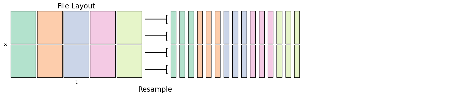
Time Resampling
Time resampling changes the temporal frequency of a dataset, say from hourly to daily. You can generally specify the operation to perform - min, mean, max etc. if going from a higher to lower frequency, or how values are interpolated if going from lower to higher frequency.
fig, axs = plt.subplots(nrows=1, ncols=3, sharey=True, figsize=(20,3))

colors = numpy.stack([['#b3e2cd', '#fdcdac', '#cbd5e8', '#f4cae4', '#e6f5c9']]*2).T

draw_chunks(axs[0], chunk_color=colors)
axs[0].set_xlabel('t', fontsize='x-large')
axs[0].set_ylabel('x', fontsize='x-large')
axs[0].set_title('File Layout', fontsize='xx-large')

resample_colors = numpy.full((15, 2), '#ffffff')
for i in range(5):
    resample_colors[3*i:3*i+3] = colors[i]

draw_chunks(axs[1], nchunks=(15,2), chunk_size=(0.5, None), chunk_color=resample_colors)

axs[2].set_frame_on(False)
axs[2].set_xticks([])
axs[2].set_yticks([])

for i in range(4):
    h = 1/4 * (i+0.5)
    conn = matplotlib.patches.ConnectionPatch((1.02, h), (-0.02, h), axs[0].transAxes, axs[1].transAxes, arrowstyle='-[', linewidth=2)
    fig.add_artist(conn)

fig.add_artist(matplotlib.text.Text(0.375, -0.05, "Resample", fontsize='xx-large',  ha='center', transform=fig.transFigure))

None
Xarray resample knows about time values, coarsen uses sample counts but can work in all dimensions. See Pandas offset strings for how to specify different resample windows. Use a reduction operator like
.mean()etc. after either of these to go from high to low frequency, or use.resample().interpolate()to go from low to high frequencyCDO see e.g.
cdo --operators | grep meanfor means on different timescales
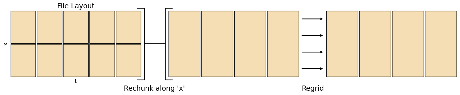
Horizontal Regridding
Regridding converts data to a different resolution, useful when comparing two datasets. Note regridding only fills in gaps, it doesn’t give any information at a finer scale than the source data.
There’s a number of different regridding methods that can be used
Conservative
Bilinear
Patch
Nearest source to destination / Nearest grid point
See the Xesmf comparison of regridding algorithms for illustrations of each method.
If the source dataset is masked, check the output along coastlines to make sure that it has been dealt with correctly. Most regridders can fill in masked regions using different extrapolation methods, which is useful if masks don’t line up exactly. Conservative regridding has different behaviour along coastlines in normed and un-normed modes, in normed mode it will consider the mask on the target grid.
fig, axs = plt.subplots(nrows=1, ncols=3, sharey=True, figsize=(20,3))

draw_chunks(axs[0])
axs[0].set_xlabel('t', fontsize='x-large')
axs[0].set_ylabel('x', fontsize='x-large')
axs[0].set_title('File Layout', fontsize='xx-large')

draw_chunks(axs[1], nchunks=(4, 1))

draw_chunks(axs[2], nchunks=(4, 1))

regrid_conn = matplotlib.patches.ConnectionPatch((1.02, 0.5), (-0.02, 0.5), axs[0].transAxes, axs[1].transAxes, arrowstyle=']-[', mutation_scale=90, linewidth=2)
fig.add_artist(regrid_conn)

for i in range(4):
    h = 1/4 * (i+0.5)
    sort_conn = matplotlib.patches.ConnectionPatch((1.02, h), (-0.02, h), axs[1].transAxes, axs[2].transAxes, arrowstyle='->', linewidth=2)
    fig.add_artist(sort_conn)

fig.add_artist(matplotlib.text.Text(0.375, -0.05, "Rechunk along 'x'", fontsize='xx-large',  ha='center', transform=fig.transFigure))
fig.add_artist(matplotlib.text.Text(0.65, -0.05, "Regrid", fontsize='xx-large',  ha='center', transform=fig.transFigure))

None
Xarray coarsen can only lower the resolution, combining an integer number of gridpoints in each direction
xesmf Xarray interface to ESMF’s regridder
ESMF has some useful command line tools, can generate weights with
ESMF_RegridWeightGenor regrid withESMF_Regrid, lots of optionsclimtas helps setting up a dask-aware regridding
NCO Can apply CDO or ESMF weights with
ncks --mapCDO Can generate weights and regrid -
cdo --operators | grep gen,cdo --operators | grep remap
Python xesmf regridding 1 from COSIMA
Python xesmf regridding 2 from CLEX CMS
Python xesmf regridding 3 from CLEX CMS
Python regridding to a different coordinate system using pyproj part 1 from CLEX-CMS
Python regridding to a different coordinate system using pyproj part 2 from CLEX-CMS
Vertical Regridding
There are a wide variety of different vertical coordinate types used in climate datasets, including
Height/Depth
Hybrid Height / Hybrid Pressure
Isosurfaces (pressure, temperature, etc.)
Swapping between these normally uses a vertical interpolation, you will need some form of mapping from one to the other (e.g. the pressure field on the same levels as the input dataset to convert to pressure levels).
Remember that the height above/below sea level of hybrid height levels will vary with location, and the height above/below sea level of isosurfaces will vary with both location and time.
‘Hybrid’ coordinates may refer to either hybrid height or hybrid pressure in different tools/models - be sure to check definitions match!
Some transformations may benefit from calculating the interpolation logarithmically.
xgcm Vertical interpolation of Xarray datasets
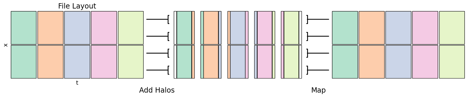
Rolling Averages
A rolling operation combines input at multiple adjacent points into a single output value, producing a smoother result.
Consider what should happen at the start and end of the dataset, possibilities for boundary conditions include
Set values to NaN
Reflected - value at
x[-n]equals value atx[n]Periodic - value at
x[-n]equals value atx[len(x) - n]
When manually implementing this, you can read values from adjacent chunks to create a halo around the target data to get the boundary conditions of that chunk
fig, axs = plt.subplots(nrows=1, ncols=3, sharey=True, figsize=(20,3))

colors = numpy.stack([['#b3e2cd', '#fdcdac', '#cbd5e8', '#f4cae4', '#e6f5c9']]*2).T

draw_chunks(axs[0], chunk_color=colors)
axs[0].set_xlabel('t', fontsize='x-large')
axs[0].set_ylabel('x', fontsize='x-large')
axs[0].set_title('File Layout', fontsize='xx-large')

halo_colors = numpy.full((15, 2), '#ffffff')

for i in range(5):
    halo_colors[1+3*i] = colors[i]
    if i > 0:
        halo_colors[0+3*i] = colors[i-1]

    if i < 4:
        halo_colors[2+3*i] = colors[i+1]

draw_chunks(axs[1], nchunks=(15, 2), chunk_size=([0.3,1.2,0.3]*5, None), chunk_color=halo_colors)

draw_chunks(axs[2], chunk_color=colors)

for i in range(4):
    h = 1/4 * (i+0.5)
    conn = matplotlib.patches.ConnectionPatch((1.02, h), (-0.02, h), axs[0].transAxes, axs[1].transAxes, arrowstyle='-[', linewidth=2)
    fig.add_artist(conn)

for i in range(4):
    h = 1/4 * (i+0.5)
    sort_conn = matplotlib.patches.ConnectionPatch((1.02, h), (-0.02, h), axs[1].transAxes, axs[2].transAxes, arrowstyle=']-', linewidth=2)
    fig.add_artist(sort_conn)

fig.add_artist(matplotlib.text.Text(0.375, -0.05, "Add Halos", fontsize='xx-large',  ha='center', transform=fig.transFigure))
fig.add_artist(matplotlib.text.Text(0.65, -0.05, "Map", fontsize='xx-large',  ha='center', transform=fig.transFigure))

None
Xarray rolling then a reduction operator like
.mean()Dask map_overlap adds a halo to map_blocks
bottleneck provides optimised rolling operations on Numpy arrays, used by Xarray automatically
CDO see
cdo --operators | grep runfor related function names
Generic Operations
These operations are the building blocks of the analyses above, they may be useful for your own calculations
Map / Reduce
Mapping just refers to applying a function to an array, returning a new array. Reduction is similar, however it returns an array with less dimensions than you started with (e.g. a mean over time).
Xarray functions keep metadata - apply_ufunc runs an arbitrary function that works on a numpy array, map_blocks applys a function to each dask chunk with the coordinates and attributes available
Dask map_blocks provides more low-level control than the Xarray version, but you don’t get the metadata
Python - Converting a function from 1D to ND from CLEX CMS
Rechunking
To rechunk a dataset is to read it in and write it back out again, but in a way that’s optimised for analysis in a different dimension - e.g. you might have a dataset that’s optimised to read lat-lon slices, but you want to create a time-series climatology.
Rechunking may also combine multiple input files - say a dataset has one file per model day that contains all of its variables, for a timeseries analysis you may want to swap this to one file per variable per model year to reduce the number of files that need to be opened in the analysis.
Xarray The encoding argument to
to_dataset()can specify file chunking, combine multiple files with open_mfdataset or concatRechunker A Python library for rechunking files in Zarr format
NCO There are several arguments to specify output chunking, see e.g.
ncks --help | grep cnk. To combine input files along time seencrcat